The thought for the day in the Oprah newsletter for February 6, 2006 read, “Your home should replenish your senses and feed your soul.” Few companies or even eras offer as many ways to achieve that goal as does West German pottery. The forms and glazes on West German pottery are fascinating enough, but when you consider the soil from which such vitality and whimsy grew, the story takes on another dimension.
Work backwards through history and we have the economic struggles and political tensions of the 1970’s, the cold war of the 1960’s and 1950’s. We have WWII, the Nazi repressions, and for Germany and much of Europe, the slow recovery from WWI. That takes us to the time of the Bauhaus school, one of the most influential design schools of all time, an enduring, worldwide influence currently visible in Jonathan Adler’s designs.
The Bauhaus school represented modern, forward thinking, not exactly something the Nazi party favored. The pottery portion of the school closed in 1925, followed by the rest of the school in the early 30’s. Energy and resources were soon poured into the war, but the end result was psychological, emotional and physical rubble. Surely any art that could grow from such soil would echo Edvard Munch’s The Scream.
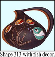
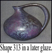
 Instead, there came forms such as Ruscha’s shape 313 designed by Kurt Tschörner, elegance mixed with exaggeration, perfect proportions that please the eye and tickle the senses. Decorations ranged from cute mixed with innocence to geometric designs that somehow mixed a sense of challenge with a sense of humor. It certainly made marketing sense. Instead of Calgon, it was “Pottery, take me away.”
Through the 1950’s and into the early 60’s, the most popular designs echoed the Art Deco period, particularly the vitality of that era plus the insistent innocence that later infused “Happy Days”. However, unlike the angular, geometric forms of the Art Deco period, many of the early West German forms featured gentle curves, just not quite where you expected to find them. While some forms maintained a classic look, asymmetry gave others the look of caricature.
 From around 1965 into the mid 70’s, forms and colors grew more exaggerated and more intense without losing that fine sense of proportion and whimsy. In a paradox typical of this pottery, soothing earthtone glazes were popular at the same time, sometimes on the same piece with a vibrant orange or other lively Pop Art shade. Lava glazes and other textural elements added another level of variety and complexity.
Beginning in the early 70’s, a weak economy began to take its toll, and factories closed. By the mid 70’s, it was clear that the special drive that grew out of repression was losing momentum, and one of the great eras in art pottery was coming to a close. But the more I’m around the better pieces, the more I believe that the spirit that enabled art and artists to survive was poured into the pottery, and the vitality went not only into a range of creativity possibly unmatched for breadth and depth but into the designs and clay.
This art became not only the result of vitality but about vitality, and that strength and energy come out in the pottery even now, radiating into the room. Even the sense of whimsy underlying so much of the art is about survival because without the perspective supplied by humor survival becomes about hardness, not hope.
Ways to Collect West German Pottery
Some collectors have stumbled into the W. German field by buying an item or two at the low-risk cost found at yard sales or thrift shops. Others have seen some sweet items available but can’t quite decide to take the chance. Quite often the question is, “where do I go from here?” What does it mean to collect West German pottery? That’s a big question for a novice in any collecting category, but it’s even bigger when the field is virtually untraveled with no well-worn paths to follow and no books acting as maps, not even a good idea of what the choices are.
The beginning point is the same in any collecting field: start according to your taste, budget, and experience. As with any good philosophy, the idea is simple and straightforward. It’s the application that’s hard. Budget is the easiest part for most of us, those who consider the term extra money an oxymoron. Still, just because we’re broke doesn’t mean we don’t need beauty around us.
Rule number one is buy the best you can afford. Sometimes that means buying one really good piece, sometimes buying two or three fairly good pieces. It also means don’t go wild and buy a bunch of poorly done pieces just for the sake of quantity. Even though the most widely available items are the tourist pieces, there are better and worse pieces even within that category.
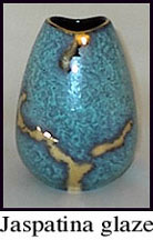
For inexperienced collectors, there’s a sub-category of vases with gold glazes that makes a good entry point. Several companies did items with gold-highlighted glazes. In this case, that means gold glaze, not just gold that’s painted on. A gold glaze can be rather tricky, so there’s value in the difficulty as well as the appearance.
Most of the vases in this category are relatively small (3-6″) and often have fairly traditional, classic forms. Prices on these tend to be low, particularly compared to the aesthetic value, and even when W. German items become more widely known, many of the simple versions will stay within relatively easy economic reach. However, there are also nicer items within the category.
The potential value on the gold glazes is based on form, glaze complexity, and size. The odd, exaggerated forms represent the period and will generally be more prized by mid-century collectors. Glazes with more complex, usually abstract, patterns will also command a higher price. Collectors of American art pottery will find some items reminiscent of Weller Cloudburst.
 Collectors in this field can work up from fairly mass market items to the finer versions. Makers include Bay and Carstens, but the Jaspatina glaze from Jasba is among the best. Items over 8″ appear to be uncommon, and glazes combining red and gold among the most uncommon. Most of the gold-glazed work dates from 1956 to the early 1960’s.
While much of the W. German work is unusual in form and decoration, collectors can often find connections with other fields to bring a sense of familiarity that may help collectors determine just where they’re tastes and preferences lie within the W. German field. For example, many W. German items have archaic decorations and coloring that fit well with a southwestern theme.
Even glass collectors will find connections, especially those who collect Blenko or Pilgrim. The strong colors and emphasis on large items will make those collectors feel right at home. Collecting through such comparisons also opens intriguing cross-collecting possibilities.
I’ve found that many collectors get a bit fixated on a particular item or style, but playing glass off of pottery or one style with another can create surprising combinations with a feeling all their own. I know one collector who puts her 1970’s Pop Art vases alongside her utilitarian crocks and is delighted with the result. Perhaps the idea just brings out the child in me, going back to happy hours spent combining blocks in every combination possible and mixing in other toys just to see what happened.
 Several companies also used a motif that I call a heartstripe, an irregular, horizontal band of contrasting color around the center of the vase. These stripes are most often found in orange or red, which suggests a vitality emanating from the center. In some cases, the stripe is bound top and bottom by a lava glaze that creates a geological look and opens numerous philosophical readings for those so inclined. Scheurich, Carstens, Steuler, and Hutschenreuther were particularly fond of this motif.
It’s also possible to collect by shape or glaze. Many of the shapes were produced for a fairly long period and can be found in numerous glazes. Two particular examples are Ruscha shape 313 (designed by Kurt Tschörner) and Scheurich shape 271 (designed by Hans Siery). Both shapes are fairly easily found, but coming up with all the glazes could be a lifetime project. Ruscha 313 was produced for about 30 years and 50 or so different glazes.
Perhaps the only way I don’t suggest collecting is by name. In W. German pottery, it’s rather difficult anyway since both the company and the designer are so often still unknown. However, the real problem is that collecting by name has a tendency to run up the cost without relationship to any real value. At the moment, pieces attributed to Bodo Mans sell higher just because of the name, and the ironic part is that this name value comes from Mans’ connection to France and Picasso, an odd reason to buy German pottery.
Some of the Mans designs are certainly attractive, but others are much less so, and there’s serious doubt about some of the attributions. On the other hand, I’m personally fond of designs I’ve seen by Cari Zalloni, so there can certainly be connections between collector and designer. The trick is to always consider the piece, not just the name.
In some respects, collecting should be done much like child raising, with a mix of freedom and control. A good collection really is much like a living thing, growing in often unexpected ways and sometimes needing to leave some things behind. Fortunately, with a collection you can sell or give away the items that no longer please you as they once did, a method not generally approved of with children.
Still, you don’t have to worry about getting your collection “right”. You will change, and so will the collection and your relationship with it. Be willing to take some chances (within the limits of your budget) and buy a piece that speaks to you even though it doesn’t seem to fit right now.
Even with the pieces you have at home, think of them like the blocks you played with as a kid, moving them around, always trying new arrangements just to see how the relationships change. Try the soothing items in one room and the eye-poppers in another, then try mixing them. You may be able to create a sense of story depending on how items connect.
Most importantly, make sure that your collection makes you happy. You should enjoy walking into the room more because of the pottery. And be sure to slow down enough to let the pottery speak. Let yourself be soothed by that gentle curve or be revitalized by that orange heartstripe.
